Module selector - configuration
The module selector is configured in this section. In the finished app, this can be accessed via in the General functions section of the map.
| The module that contains the Module Selector Plugin is referred to as the base module when configuring the module selector. |
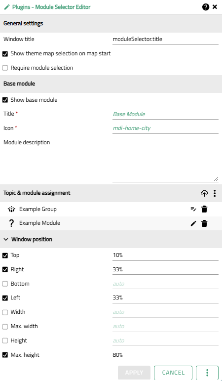
Clicking on opens the Plugin Editor window, which shows the available configuration options.

The following settings are possible:
Settings
General settings
| Option | Description |
|---|---|
Window title |
Title, which is displayed in the header of the window. The default value is a translation key (see Internationalization) that is translated by the application into "Themenkartenauswahl" (de) or "Theme map selection" (en). |
Show theme map selection on map start |
Specifies whether the theme map selection window is already open when the application is started. |
Require module selection |
Indicates whether the “Start application” button in the theme map selection window is active if no module (apart from the base module) has yet been selected. If the checkbox is activated, a module selection is required before the application can be started. |
Base module
| Option | Description |
|---|---|
Show base module |
Specifies whether the base module in which the plugin is integrated is shown as a module card in the theme map selection. As the base module contains the theme map selection, this module is permanently active and cannot be deactivated. |
Title |
Title which is displayed on the card of the base module. |
Icon |
Icon which is displayed on the card of the base module. Only Material Design Icons are possible, which are specified using the syntax |
Module Description |
Short description of the content of the module (optional). If a description is specified, an |
Topic & module assignment
The module selection window is generated later from this list and is determined by the modules/groups shown here and their display titles and icons.
The order of the items influences the display sequence later on and can be adjusted using drag & drop.
| Action | ..UI |
|---|---|
Add module (via Publisher) |
|
Add module (via URL) |
|
Edit module |
|
Edit module group* |
|
Delete module/group |
Window Position
Option |
Description |
Top |
Specifies the positioning (distance) of the top edge of the window relative to map view in pixels (px) or percent (%). The default value is 10%. |
Right |
Specifies the positioning (distance) of the right edge of the window relative to map view in pixels (px) or percent (%). The default value is 33%. |
Bottom |
Specifies the positioning (distance) of the bottom edge of the window relative to map view in pixels (px) or percent (%). |
Left |
Specifies the positioning (distance) of the left edge of the window relative to map view in pixels (px) or percent (%). The default value is 33%. |
Width |
Fixed width of the window in pixels (px) or percent (%). This value is strictly adhered to regardless of the content. Due to the dimensions of the module cards, a value greater than 200 px is recommended. |
Max. Width |
Maximum width of the window in pixels (px) or percent (%). The window height is adapted to the content, but does not exceed the specified value. |
Height |
Fixed height of the window in pixels (px) or percent (%). This value is strictly adhered to regardless of the content. Due to the dimensions of the module cards, a value greater than 200 px is recommended. |
Max. Height |
Maximum height of the window in pixels (px) or percent (%). The window width is adapted to the content, but does not exceed the specified value. The default value is 80%. |
Module settings
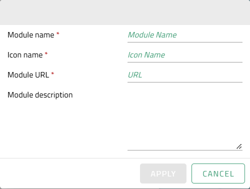
If the Add module or Edit module option is selected, a separate window opens for entering or editing the module settings.

| Option | Description |
|---|---|
Module Name |
Title, which is displayed on the card of the group in the module selection. |
Icon Name |
Icon which is displayed on the card of the group in the module selection. Only Material Design Icons are possible, which are specified using the syntax |
Module URL |
Manual specification of a URL that points to the JSON file containing the desired module configuration. In this way, modules that are located outside the Publisher project can also be integrated. |
Module description |
Short description of the content of the module (optional). If a description is specified, an |
Group settings
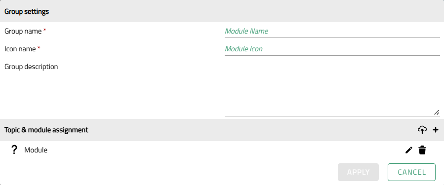
If the Add group or Edit module group option is selected, a separate window opens for entering or editing group settings.

Group settings
| Option | Description |
|---|---|
Group Name |
Title, which is displayed on the card of the group in the module selection. |
Icon Name |
Icon which is displayed on the card of the group. Only Material Design Icons are possible, which are specified using the syntax |
Group description |
Short description of the content of the group (optional). If a description is specified, an |
Topic & Module Assignment
The Group level of the module selection window is generated later from this list and is determined by the modules shown here and their display titles and icons.
The order of the items influences the display sequence later on and can be adjusted using drag & drop.
| Action | ..UI |
|---|---|
Add module (via Publisher) |
|
Add module (via URL) |
|
Edit module |
|
Delete module |
Application examples
| Basic information on the module concept can be found in the App Configurator section. |
Digital base twin as a starting point
Conceptually, a module with data from the digital base twin can be used as the base module for the module selector (i.e. as a minimum: a digital terrain model, a base map, the digital 3D city model).
In addition, various application topics (e.g. flood risk, solar potential, urban planning, etc.) can each be packaged in their own modules, which then provide all the necessary data, configurations and plug-ins for the relevant topic and extend the base twin to suit the specific application.
These can be, for example
-
additional map layers that extend the content tree.
-
Availability/application of style definitions to the city model to visualize/highlight a topic based on existing attribute data.
-
Additional plugins to enable thematically relevant analysis and actions.
The module selection plugin is integrated into the module with the data of the digital base twin. This makes it the base module of the map application.
Assuming that it should also be possible for end users to work exclusively with the base twin, the “Show base module” option must be activated in the settings so that the base twin receives its own card in the module selection. At the same time, the “Require module selection” option should be deactivated so that users can also start the application without selecting a module in addition to the base module.
Entry point to different city models
Alternatively, a module that only contains a 2D base map for an overview can be configured as a base module for the module selection, and thus be the entry point to several independent city models of a region.
The individual city models can be packaged accordingly in their own modules, which then provide all the necessary data, configurations and plug-ins for the respective city or municipality. After selection of the respective module via the module selection window, the pure (2D) base map is extended by the 3D view, 3D map layers and other supplementary content and relevant plugins for the specific city/municipality.
Assuming that the base module is only intended to provide an overview and introduction, end users should probably be guided to first select a city/municipality whose map application they would like to continue working with. The base module itself therefore offers no further added value; in the settings, the “Show base module” option should be deactivated accordingly so that the base module does not appear as an option in the module selection. At the same time, the option “Require module selection” should be activated so that the selection of a city or municipality-specific module is required first, before the application can be started.