VC Story - Configuration
The following describes the configuration of the VC Story with the editor.
|
The VC Story enables interactive storytelling by linking traditional web content with 3D map interactions. |
Clicking on  opens the configuration window, which shows the available configuration options.
 General settings
The General Settings define the basic behavior of the VC Story. These include the presentation mode, the startup behavior as well as the navigation options for the slide mode.
| Setting | Description |
|---|---|
|
Determines how the VC Story is displayed. The following options are available:
|
|
If this option is enabled, the VC Story is automatically opened and started when the application loads. |
If the Slides mode is selected, the following additional settings are available:
| Setting | Description |
|---|---|
|
Determines how navigation between slides works. The following options are available:
|
|
If this option is enabled, the slides are played automatically one after another. This setting is only available if In the player has been selected under Navigation. |
Sections
Sections are the core building blocks of the VC Story. Each section contains elements and actions and corresponds to one step of the presentation - a slide in slide mode or a scroll area in scroll mode.
In the Story Editor, each section is displayed as a card in the section overview, showing a scaled preview of the contained elements as well as a sequential number. At the bottom of each card are buttons for editing the section.
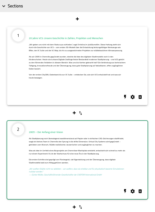
Creating a section
A new section is created via the  symbol, which appears above and below each section card.
In slide mode, the slide is placed by drawing a rectangle over the map.
By clicking and dragging the mouse, a rectangle is drawn that defines the position and size of the new slide on the screen.
While drawing, the current width and height are displayed in pixels.
After releasing the mouse button, a dialog opens in which the title and window position can be set.
Clicking Insert creates the section.
In scroll mode, the creation dialog opens directly, without having to draw an area.
Editing a section
Clicking on a section card and the buttons at the bottom of the card allows the content of a section to be edited: adding elements, assigning actions, and adjusting general settings and the window position.
The section card currently being edited is highlighted with a border in the primary color. In addition, the corresponding editor view of the section is opened and all assigned actions are activated.
Editing can be ended by clicking the section card again.
Adding elements
Clicking on the section card opens the editor view of the section. Here, elements can be added, rearranged and removed.
All information about the available element types and their configuration can be found in the elements chapter.
Assigning actions
The  symbol at the bottom of a section card opens the Actions Editor for this section.
There, existing actions can be assigned to the section, or new actions can be created.
symbol at the bottom of a section card opens the Actions Editor for this section.
There, existing actions can be assigned to the section, or new actions can be created.
When a section is displayed, all assigned actions are activated; when the section is left, they are deactivated again.
All information about the available action types and their configuration can be found in the actions chapter.
Section settings
The  symbol at the bottom of a section card opens the settings for this section.
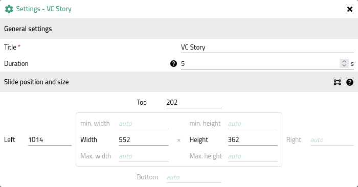
General settings
| Setting | Description |
|---|---|
Title |
Name of the section. Required field. Displayed as an entry in the section overview. |
Duration |
Display duration of the section in autoplay mode, in seconds. Only available in slide mode. |
Slide position and size
In slide mode, the position and size of the slide window can additionally be configured.
Values can be entered as pixels (e.g. 320px or 320) or percent (e.g. 50%).
Setting height to auto makes the window height adapt to its content.
|
Changes to the window position are shown immediately as a preview in the card. |
The  Redraw slide button allows the slide to be repositioned on the map.
This opens the same drawing view used when the section was first created.
Redraw slide button allows the slide to be repositioned on the map.
This opens the same drawing view used when the section was first created.
Changing the order and deleting a section
Between any two adjacent section cards there is an  symbol.
Clicking it swaps the order of the two adjacent sections.
symbol.
Clicking it swaps the order of the two adjacent sections.
The  symbol at the bottom of the section card is used to delete a section.
A confirmation dialog opens before the section is permanently removed.
symbol at the bottom of the section card is used to delete a section.
A confirmation dialog opens before the section is permanently removed.
Elements
Elements are the building blocks of a section, like text, image galleries or buttons.
At the beginning and end of an element there is an  symbol.
Hovering over it with the mouse opens a bar with options for adding a new element at that position.
If the section already contains several elements, this bar also shows the symbol, which can be used to swap the order of the two adjacent elements.
symbol.
Hovering over it with the mouse opens a bar with options for adding a new element at that position.
If the section already contains several elements, this bar also shows the symbol, which can be used to swap the order of the two adjacent elements.
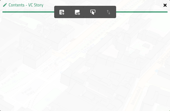
Hovering over an existing element with the mouse displays icons for editing () and deleting ().
Clicking on the primary-colored area next to the icons hides them.
This also allows buttons and image carousels to be tested.
 Text element
Element for displaying formatted text blocks.
Editing the text element opens a WYSIWYG editor for entering and formatting text, either in visual or HTML mode.
In addition to common formatting options such as bold, italic, font size, lists and alignment, the icons allow inserting text color ( ), links (
 ) and images (
 ).
).
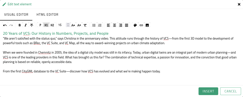
 Image carousel element
Adds images to a carousel via URL.

The icon is used to add new images to the carousel.
Entries that have already been added can be removed again via the icon.
The following configuration options are available:
| Option | Description |
|---|---|
Height |
Height that is applied uniformly to all images of the carousel, in pixels. |
Cover |
If active, the image is scaled to fill the full width of the section and the specified height, cropping any overflow. |
Image |
URL of the image. |
 Button element
Allows adding a control element that can be used to activate and deactivate an action.
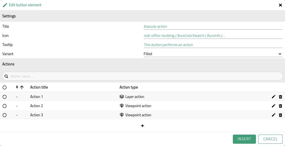
The following configuration options are available:
| Option | Description |
|---|---|
Title |
Text displayed on the button. Required if no icon is specified. |
Icon |
Material Design Icon displayed on the button. Required if no title is specified. |
Tooltip |
Optional hint text displayed when hovering over the button with the mouse. |
Variant |
|
Assigning actions
The Actions Editor can be used to assign existing actions to the button or to create new actions. On the first click on the button, the assigned actions are activated; on the next click, they are deactivated again.
All information about the available action types and their configuration can be found in the actions chapter.


Actions
In the VC Story, actions are used to perform various map interactions. These include, for example, changing the view, activating layers or highlighting buildings.
Actions can be assigned to both sections and buttons. When a section is displayed, or on the first click of a button, all assigned actions are executed. When the section is left, or the button is clicked again, the actions are deactivated again. Click on the respective link to see how to assign actions to sections or buttons.
The Actions Editor consists of a searchable table and an button for adding new actions.
The table lists all actions that have already been added to this VC Story.
For example, if an action is created for a section, it can later also be assigned to a button.
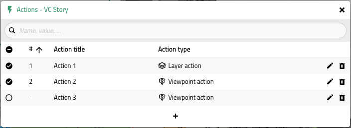
The table of the Actions Editor has the following columns:
| Column | Description |
|---|---|
Selection ( |
Select ( |
Execution order (#) |
Indicates the execution order of the action within the respective section/button.
Actions that are not selected are shown with |
Action title |
The title of the action. |
Action type |
The type of the action, shown with an icon and the corresponding type name. |
Edit/Delete |
The |


The execution order determines the order in which the actions assigned to a section or button are executed. This is decisive, for example, when both a flight action and a layer style action are selected. If the flight action comes before the layer style action in the order, the entire flight is completed before the style is applied. It can therefore be useful to place the flight action at the very end of the order. The execution order is determined by the order in which the actions were selected.
Clicking the icon below the table adds a new action.
All available action types, along with their respective configuration options, are listed below:
 Viewpoint action
Changes the map view to a predefined viewpoint.
| Option | Description |
|---|---|
Viewpoint |
Selection of a viewpoint from the app configuration. |
Title |
The title of the action. Is automatically filled with the name of the selected viewpoint, but can be overwritten. |
 Flight action
Starts a predefined flight.
| Option | Description |
|---|---|
Flight |
Selection of a flight from the app configuration. |
Title |
The title of the action. Is automatically filled with the name of the selected flight, but can be overwritten. |
 Rotation action
Rotates around a viewpoint at a defined speed.
| Option | Description |
|---|---|
Viewpoint |
Selection of a viewpoint from the app configuration. |
Title |
The title of the action. Is automatically filled with the name of the selected viewpoint, but can be overwritten. |
Time per rotation |
Time in seconds that a 360 degree rotation should take. |
 Layer action
Activates a layer.
| Option | Description |
|---|---|
Layer |
Selection of a layer from the app configuration. |
Title |
The title of the action. Is automatically filled with the name of the selected layer, but can be overwritten. |
 Layer style action
Changes the style of a layer.
| Option | Description |
|---|---|
Layer |
Selection of a layer from the app configuration. |
Style |
Selection of a style from the app configuration. |
Title |
The title of the action. Is automatically composed of the name of the selected layer and the selected style, but can be overwritten. |
 Highlight action
Highlights selected objects of a layer in color.
| Option | Description |
|---|---|
Layer |
Selection of a layer from the app configuration. |
Title |
The title of the action. Is automatically filled with the name of the selected layer, but can be overwritten. |
Highlighted object IDs |
List of all object IDs selected for highlighting.
Clicking the |

 Hide action
Hides selected objects of a layer.
| Option | Description |
|---|---|
Layer |
Selection of a layer from the app configuration. |
Title |
The title of the action. Is automatically filled with the name of the selected layer, but can be overwritten. |
Hidden object IDs |
List of all object IDs selected for hiding.
Clicking the |
 Map action
Switches the map view (e.g. from 2D to 3D).
| Option | Description |
|---|---|
Map |
Selection of a map from the app configuration. |
Title |
The title of the action. Is automatically filled with the name of the selected map, but can be overwritten. |
 Planning action
Displays plannings from VC Planner. This is subject to the visibility settings of the VC Planner. If a planning is private, the Story user must be logged in to the Planner to see it. Public plannings can be seen by everyone.
|
To use this action, the |
| Option | Description |
|---|---|
Planning |
Selection of a planning. |
Title |
The title of the action. Is automatically filled with the name of the selected planning, but can be overwritten. |
|
Note that plannings can also contain viewpoints. When a planning is activated via the action, the corresponding viewpoint is also flown to. |
 Swipe Tool action
Activates the Swipe Tool with a defined state.
|
To use this action, the |
Configuration is done via Plugin actions: adopting state from the map or directly in the JSON editor.
Structure
The general JSON structure of actions is described in the [id_story_actions_custom] chapter.
The action is defined by the following callbacks:
-
create:
ActivateSwipeToolCallback -
destroy:
DeactivateSwipeToolCallback
ActivateSwipeToolCallback
The following parameters are available for ActivateSwipeToolCallback:
| Option | URL key | Type | Description |
|---|---|---|---|
splitPosition |
sp |
|
Position between 0 and 1 for the vertical placement of the divider. |
swipeLayerStates |
swl |
|
Layer names with their associated state. |
 Shadow action
Activates the Simulate shadow tool with a defined state.
|
To use this action, the |
Configuration is done via Plugin actions: adopting state from the map or directly in the JSON editor.
Structure
The general JSON structure of actions is described in the [id_story_actions_custom] chapter.
The action is defined by the following callbacks:
-
create:
ActivateShadowCallback -
destroy:
DeactivateShadowCallback
ActivateShadowCallback
The shadow action uses ActivateShadowCallback to activate the shadow tool. All date and time values are ISO 8601 strings.
The following parameters are available for ActivateShadowCallback:
| Option | URL key | Type | Description |
|---|---|---|---|
originalTime |
ot |
|
Baseline ISO 8601 time captured when the shadow simulation is activated for the first time. Used to restore the original map time when closing. |
timeOnClose |
toc |
|
Last ISO 8601 time when the tool was closed/deactivated. Used to resume the previous position the next time it is activated. |
animate |
a |
|
Whether the automatic shadow animation should start immediately after activation. |
duration |
d |
|
Total duration of one animation cycle in the currently selected time unit. |
timeUnit |
tu |
|
Time unit for the animation and duration interpretation (e.g. day or year). |
endDate |
ed |
|
Optional ISO 8601 target time at which the animation stops and the state is reset. |
 Viewshed action
Activates the Viewshed plugin with a defined state.
|
To use this action, the |
Configuration is done via Plugin actions: adopting state from the map or directly in the JSON editor.
Structure
The general JSON structure of actions is described in the [id_story_actions_custom] chapter.
The action is defined by the following callbacks:
-
create:
ActivateViewshedCallback -
destroy:
DeactivateViewshedCallback
ActivateViewshedCallback
The following parameters are available for ActivateViewshedCallback:
| Option | Type | Description |
|---|---|---|
m |
|
The mode in which the plugin should be activated.
In most cases, |
cv |
Optional viewshed to display. Required for the |
ViewshedOptions
| Option | Type | Description |
|---|---|---|
viewshedType |
|
The type of the viewshed to display. |
position |
|
Position of the viewshed in WGS84 coordinates |
orientation |
|
Orientation of the viewshed (heading, pitch and roll) in radians (cone type only). |
heightOffset |
|
Height offset added to the Z value of the position. |
Example
{
"title": "Viewshed",
"create": {
"type": "ActivateViewshedCallback",
"m": "view",
"cv": {
"viewshedType": "cone",
"position": [
13.409820316918728,
52.51682689239382,
32.35967345343988
],
"frustumOptions": {
"fov": 1.0471975511965976,
"far": 617.9644908664328,
"near": 1,
"aspectRatio": 1
},
"orientation": {
"heading": 0.10975372463480682,
"pitch": 0.04327634037856498,
"roll": 0
},
"colorOptions": {
"visibleColor": "#ff990080",
"shadowColor": "#3333331a"
},
"showPrimitive": true,
"heightOffset": 0
}
},
"destroy": {
"type": "DeactivateViewshedCallback"
}
} Custom action
Custom actions make it possible to define your own actions in addition to the predefined ones. Configuration is done directly via a JSON editor.
Structure
A custom action has the following JSON structure:
{
  "title": "My action",
  "create": {
    "type": "CallbackTypeName",
    ...
  },
  "destroy": {
    "type": "CallbackTypeName",
    ...
  }
}| Field | Description |
|---|---|
title |
The title of the action, displayed in the table of the Actions Editor. |
create |
Callback executed when the action is activated (e.g. when a section is displayed or on the first click of a button). |
destroy |
Callback executed when the action is deactivated (e.g. when a section is left or on another click of a button). Can be omitted if not required. |
Example
The following example activates a clipping polygon when a section is displayed and deactivates it again when it is left:
{
  "title": "Activate clipping polygon",
  "create": {
    "type": "ActivateClippingPolygonCallback",
    "name": ["myClippingPolygon"]
  },
  "destroy": {
    "type": "DeactivateClippingPolygonCallback",
    "name": ["myClippingPolygon"]
  }
}
Available callbacks
A complete list of all available callbacks with their parameters can be found here.
Plugin actions: adopting state from the map
For some plugin actions, it is possible to make the settings via the plugin itself and adopt that state for the action. This means it is not necessary to make changes manually in the JSON editor. The individual steps are explained below:
-
First, close the VC Story Editor and apply your changes if needed.
Make sure not to add an empty plugin action, as this would otherwise overwrite the configured state of the plugins in the preview. -
Deselect the module by clicking on the module name in the App Configurator window.
-
Close the App Configurator window to have full access to the toolbar.
-
Activate the plugin belonging to the plugin action in the toolbar and make the desired settings.
-
Open the App Configurator window again, select the module containing the VC Story Editor and click "Edit components".
-
In the VC Story Editor, open the Actions Editor for the respective section or button.
-
Select the action type via "Create new action". The JSON input is now automatically filled with the contents of the plugin. If you want to adjust the name of the action, you can change the name in the JSON under
"title": "Action Name". You can now save the action.
|
For this workflow, it is important that the section/button has not already been assigned a plugin action of the same type. This also applies to actions that were saved empty. Otherwise, in step 6, the preview of the already assigned action is executed and the configured state is overwritten. |